Digital Resources Event-Based & Seasonal Style Personal Style & Fashion

Keep Soft Autumn Colors from Looking Dull

Selling fast — 56 people bought this in the last 24 hours
Popular right now — 277 people are viewing this product
Just purchased — Harper N. from Montana bought this 5 min ago
What you'll get
Full digital product — instant access after purchase
Works on any device — phone, tablet, desktop
Free lifetime updates included
30-day satisfaction guarantee
Shipping Time: Shipping cost:
Secure Checkout
Instant Access
30-Day Guarantee

A complete digital product, made by experts and yours to keep for good. Get instant access the moment you buy. Compatible with all devices.

30-day guarantee — full refund if the tool doesn't match its description or you can't access it. Once accessed, refunds aren't available for change of mind.

Instant digital delivery — access immediately after purchase. Works on phone, tablet, or desktop. Includes free lifetime updates.

AUTUMN SEASON

Keep Soft Autumn Colors from Looking Dull

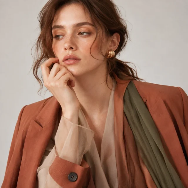
A fashion-editorial way to make Soft Autumn’s smoky olives, warm taupes, faded terracottas, muted teals, and gentle browns look nuanced and intentional rather than sleepy.

 
🔥 Nuanced, never sleepy

This resource walks you through using texture as your first source of interest, adding one clearer anchor, working with gentle contrast, and choosing prints that feel weathered rather than sharp.

Built for anyone whose Soft Autumn palette sometimes reads as sleepy instead of nuanced.

🔓 Get Instant Access

✓ Instant digital download

✓ Action-focused, not theory

✓ Read on any device, lifetime access

 
SOUND FAMILIAR?

Soft Autumn can read As sleepy instead of nuanced

“Soft” gets treated as faded away

Muted color can be mistaken for lifeless when it’s actually meant to feel gentle and nuanced.

No source of interest

Without texture doing some of the work, a soft palette can end up feeling flat instead of rich.

No contrast at all

Avoiding contrast entirely, rather than using it gently, can make an outfit feel undefined.

Sharp prints clash with softness

Crisp, high-contrast prints can fight against the gentle mood Soft Autumn is built on.

 
WHAT’S INSIDE

What’s inside

Soft, not faded away

Understand exactly why Soft Autumn’s gentleness isn’t the same as looking washed out.

Texture as your first move

Use fabric finish as the primary source of interest before reaching for anything else.

One clearer anchor

Add a single clearer element to ground an otherwise soft, blended palette.

Gentle contrast, not none

Learn to use contrast subtly instead of avoiding it entirely.

Weathered prints over sharp ones

Choose prints that feel lived-in and soft rather than crisp and high-contrast.


Stop letting softness read as sleepy, Start styling it as nuanced

Instant access — start styling your palette today.

🔓 Get Instant Access


For general informational purposes only; individual results vary.


At a glance

Format
Step-by-step Soft Autumn styling resource
Access
Instant download after checkout
Compatibility
Phone, tablet, laptop — any device
Ownership
Yours to keep, lifetime access
Refunds
Handled under the store’s Refund Policy (30 days)
Price
$PRICE
 

HERE’S EVERYTHING YOU GET

Everything inside — yours for $PRICE

The full resource

Every texture tool, anchor method, and print resource laid out and ready to use

Included

Instant digital download

Get access right after checkout

Included

Built to use, not just read

Practical and ready to put into action

Included

Access on any device

Phone, tablet, or laptop — lifetime access

Included
Regular price
Your price today
SAVE OFF
$PRICE
 

Download now

 
BEFORE YOU BUY

Questions, answered

How do I get access after I buy?
+

You’ll get instant access right after checkout, so you can start the same day.

What devices can I use this on?
+

It works on any device — phone, tablet, or laptop — and it’s yours to keep with lifetime access.

What’s your refund policy?
+

Refunds are handled under our store’s Refund Policy (30 days), which covers the details for digital access.

Do I need to add contrast to avoid looking dull?
+

A gentle amount helps — the resource focuses on subtle contrast rather than none at all or too much.

What kind of prints work best?
+

Weathered, softer prints tend to work better than sharp, high-contrast ones for this palette.

Who is this for?
+

It’s built for anyone whose Soft Autumn palette sometimes reads as sleepy instead of nuanced.

0.0
☆☆☆☆☆
0 reviews
5
4
3
2
1

Digital Product Delivery

This is a digital product. Upon payment, you receive immediate access via your account and a confirmation email. No physical shipment involved.

30-Day Satisfaction Guarantee

If this product is materially different from its listing or you experience a technical issue, you are eligible for a full refund within 30 days of purchase.

Lifetime Updates

Your purchase includes access to all future updates at no additional charge. Updates are delivered automatically to your account.

Shopping cart

×